


Designing a responsive website without using frameworks was not so easy for me as a developer when I started writing CSS. Seeing the min-width, max-width, media query, various screen sizes like 750px used to confuse me until I finally got the hang of it.
Combining the knowledge of media queries and CSS grid/flexbox, you might not necessarily need a framework, especially when you are building a website that is not robust.
Before you can take full control of your viewport, you need to give the browser permission to scale and control the page dimensions. To do this, you just add the meta element below to your web pages.
<meta name="viewport" content="width=device-width, initial-scale=1.0">
What exactly are media queries?
Personally, I understand media queries as setting limits and dictating what you want to happen within those limits. You are in control of setting the limits and also deciding what styling you want in the limits.
P.S: It is advisable to always design mobile first. When you do this, you write lesser codes and it is easier to build up to the desktop view.
Breakpoints for CSS
You set the limits by adding various breakpoints to indicate where you want the styling to start from and where you want it to add. The breakpoints I mostly use and can recommend include:
576px
768px
992px
1200px
These breakpoints have been serving me really well. Sometimes, I choose 1280px instead of the 1200px depending on the UI designs I am working with.
Let's use the media queries

Let's replicate these various page sizes using media queries.
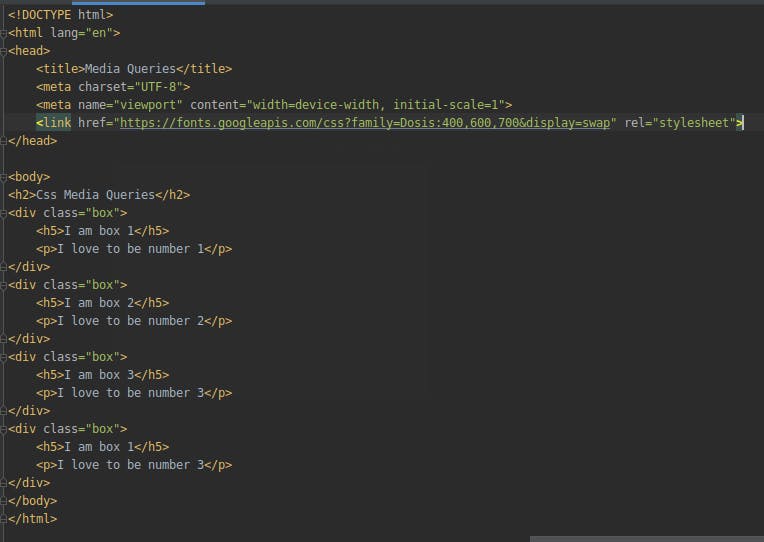
Let's start with writing the html code
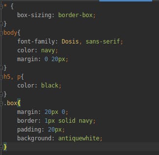
And then the CSS code
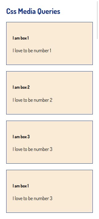
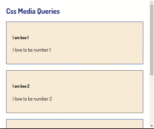
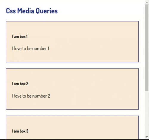
By now, we should have this
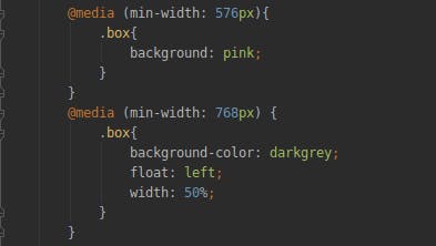
To change the background color at a width of 576px and more, we write the lines of code below.
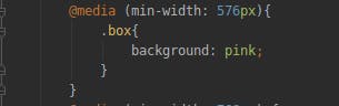
This means, when the width of the screen gets to 576px , the box background changes to pink from the antiquewhite it previously was. And until there is another breakpoint, it remains so. The gif below shows what it should look like.
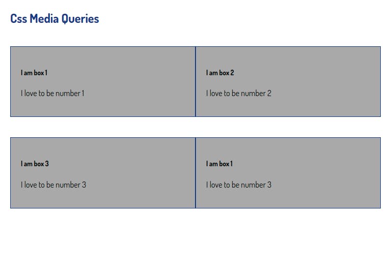
At 768px, the width of the boxes become 50% and the background color changes. We just have to add the media queries for the 768px breakpoint.
This is what it should look like now.
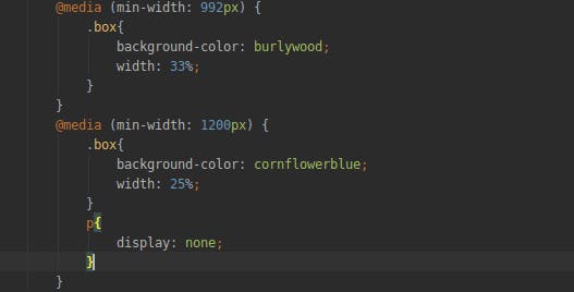
For the 992px and the 1200px breakpoints, the widths of the boxes become 33% and 25% respectively. Also, the p tag stops displaying when it gets to the 1200px breakpoint. Let's write the CSS lines of code.
Let's see what we have now.
With this, we have finally used media queries to make this simple webpage responsive. You just need to keep adding styles to each breakpoint to achieve any design you want.
To know more about media queries, you can also read:
**If this post was helpful, if you have any questions, or any contributions, please do let me know in the comment section. Thank you
**